OpenAI's Answer
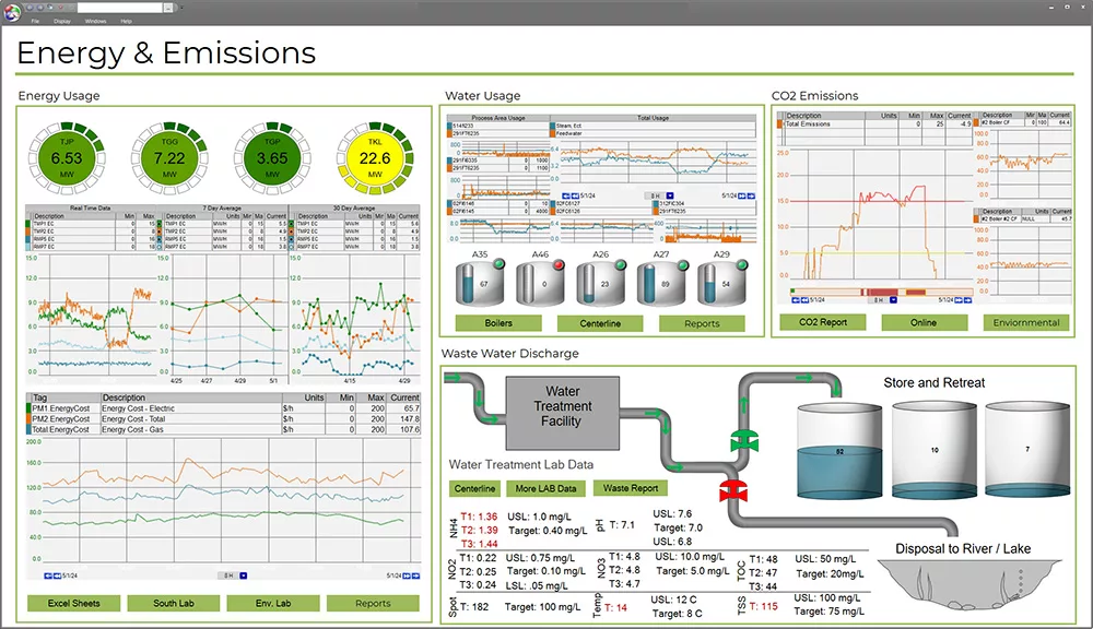
Creating a conceptual model of a digital dashboard for displaying real-time data on resource usage involves several key components. Here's a breakdown of how such a dashboard might be designed:
Main Components of the Dashboard
-
Real-Time Data Display:
- Energy Usage: Show current energy consumption with graphs and charts. Include historical data comparisons to visualize trends.
- Water Usage: Interactive visuals can illustrate daily, weekly, or monthly water consumption with options to compare against set benchmarks or goals.
- Material Usage: Track the amount and type of materials used, with options to differentiate between renewable vs. non-renewable materials.
-
Interactive Features:
- Optimization Simulations: Allow users to simulate how changes in behavior or policy can affect resource usage. For example, what if they adjust the thermostat settings or reduce waste?
- Decision Support Tools: Provide suggestions or automated recommendations based on data patterns (e.g., alerts when usage is unusually high).
-
Customizable Alerts and Notifications:
- Users can set thresholds for resource usage and receive instant alerts if usage exceeds these limits.
-
User Interface Elements:
- Dashboard Customization: Users can customize which data sets they prioritize and how they are displayed.
- Drag-and-Drop Widgets: Allow users to configure their dashboard layout, adding or removing data sections as needed.
-
Data Sources and Integration:
- Integrate with IoT devices, sensors, and other data sources to ensure data is current and accurate.
- API connections can bring in weather forecasts, grid energy mixes, or water supply data to provide context for resource usage.
-
Sustainability Metrics:
- Include metrics such as carbon footprint, water footprint, and waste reduction targets to track sustainability efforts.
Visualization Example
Create an interactive mockup/UI wireframe showing the following elements:
- Top Bar: Shows overall resource usage summary with quick stats.
- Side Menu: Allows navigation to different sections (energy, water, materials).
- Center Panels: Display detailed visualizations and interactive elements for each resource type.
- Interactive Control Panels: Users can input changes to see potential outcomes (e.g., sliders for thermostat settings).
Interactivity and Engagement
- Scenario Analysis: Let users play out different scenarios and see potential impacts on resource use.
- Gamification Elements: Reward systems that encourage users to meet resource-saving goals, enhancing engagement.
This model aims to not only inform but also empower users to make proactive decisions that optimize resource use, contributing towards sustainability goals.
Follow Up
Reference


Moonshot's Answer
A conceptual model of a digital dashboard for real-time resource usage monitoring and optimization could include the following features:
-
Real-time Data Visualization: Display key metrics on energy, water, and material usage, as suggested by sources like ThoughtSpot and Esri. This could involve animated and narrated models of resource flows to engage viewers, as discussed in a paper on animated visual representation.
-
Interactive Elements: Incorporate interactive visual tools evaluated in studies like the one mentioned in ScienceDirect, allowing users to manipulate data and see the impact of different decisions on resource usage.
-
Optimization Algorithms: Integrate algorithms that suggest optimal usage patterns based on historical and real-time data, as identified in research on sustainable green building space design models.
-
Digital Twin Technology: Utilize digital twin technology to mirror the physical environment in the digital space, enabling real-time monitoring and optimization of resource use, as outlined in mdpi.com.
-
User-friendly Interface: Ensure the dashboard is user-friendly, with interactive displays of building operations and energy use, as mentioned in aceee.org.
-
Decision Support System: Include a decision support system that provides insights and recommendations for optimizing resource use, potentially using AI and data analytics, as suggested in Energy Central.
-
Customizability and Scalability: Allow the dashboard to be tailored to different audiences and easily share results, as highlighted by Esri.
-
Historical and Predictive Analytics: Enable the dashboard to show not only current usage but also historical data and predictions for future consumption, helping in planning and decision-making.
To visualize this concept, images such as the ones from the provided links can be used, depicting various aspects of a digital dashboard, including animated visual representations, interactive elements, and real-time data displays. These images can help in understanding how a digital dashboard could function and what it might look like in practice.
Follow Up
Related
Why did the keyboard player James Baney leave the band in 2012?
Which singles did Mark Ronson release before 'Late Night Feelings'?
What is the role of PDGFR in the PDGF signaling pathway?
How did early designers of steel plate shear walls overlook the system's post-buckling behavior?
How can scenario analysis be useful for evaluating liquidity risk?
What notable achievements are associated with UCLA Anderson School of Management?